The most encouraging sign in the exploration of a form is when people really begin to think outside of its set definitions. It’s not every day you find a picture book that plays with readers’ expectations and takes them on a completely unexpected journey. Today I thought I’d talk about two books published this year that managed to do just that.
Count the Monkeys is yet another example of the fabulous Mac Barnett‘s work. Anybody who is trying to be a picture book author, I think, should really do a study of his work to see just how creatively he thinks as an author. He understands that the medium is more visual, but he always comes up with witty and intelligent concepts that illustrators can then work with, which ultimately create a winning combination of both text and image.
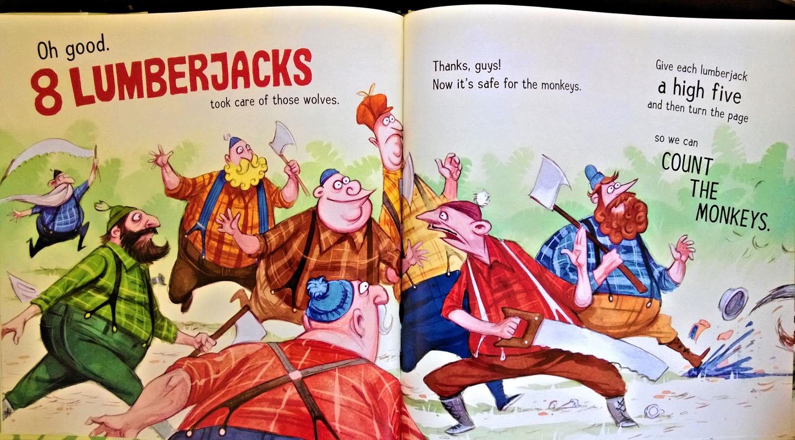
The premise of Count the Monkeys is what makes it such an ingenious book. He teases and plays with the common perception of what a counting book is, and ultimately inverts it on its head. I can’t possibly tell you how because it would give everything away. All I can say is… cheeky, cheeky! With Kevin Cornell‘s hilarious and expressive illustrations accompanying Mac Barnett’s whacky conversational narration, this is one delight of a book.

Illustrations copyright © 2013 by Kevin Cornell
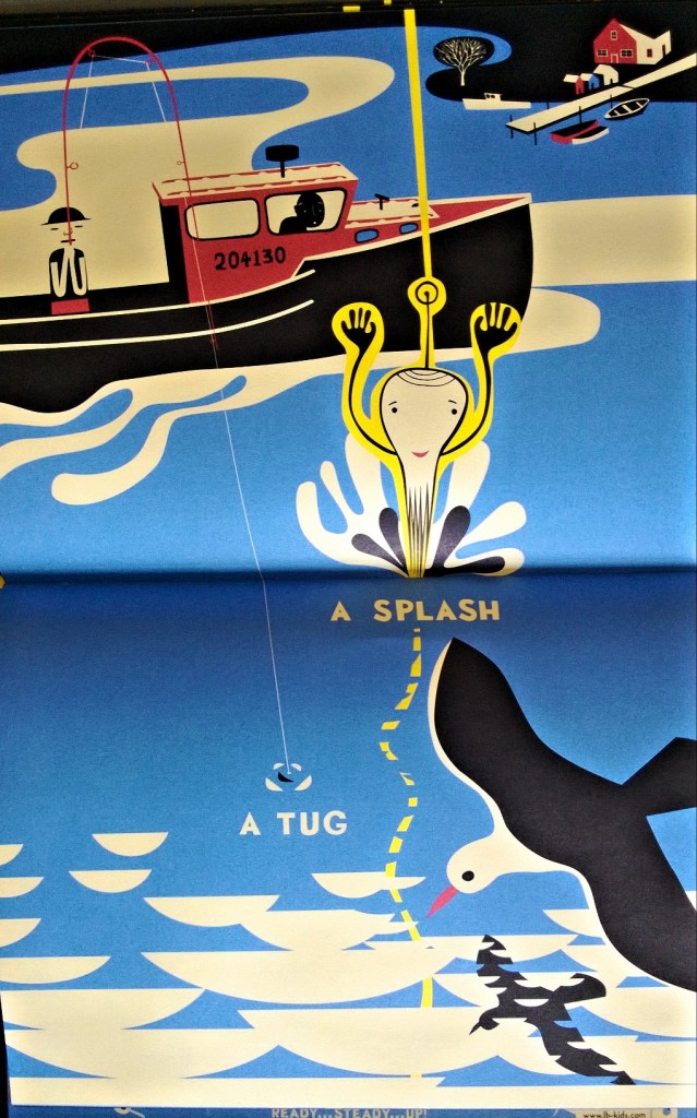
The second book is A Long Way Away by author-illustrator Frank Viva. This book is unconventional in both its storytelling style and format. The pages are flipped from top to bottom instead of left to right like a traditional book. Also, the concept is a two way story, so it introduces a whole new way of reading a book. What you think is the end is actually just the beginning of a new tale. When you read it from top to bottom the first time, it is a story that moves from outer space and ends in the deep seas. And then of course you can read it backwards. With bright and bold visuals, the narrative is seamless and meticulously crafted. Just based on the direction in which you are seeing the visuals add a whole new meaning, along with the order in which you read the text. The only thing that makes me a little sad is that it says ‘A Two-Way Story’ on the cover. I guess putting it there helps to immediately set it apart from other books by calling out what is unique to it, but it took a bit of the suspense out for me. Having said that though, it didn’t take away from the incredible journey that awaited inside.

Ultimately, creating unexpected stories always makes for a rewarding reader experience. Such surprises aren’t at all common in picture books, and it’s great to see that there are still creators out there working hard to keep you guessing.


6 thoughts on “Not what they seem: playing with perception in picture books”
With a name like ‘Count the Monkeys’ you just couldn’t go wrong…loved the post and sending you a big thumbs up from ‘A Long Way Away’ too 🙂 🙂
Hahahaha, totally agree, Chrishelle. Honestly, you need to read the book to see just how fun it is. Even as an adult reading it, I was completely surprised by the end — and that’s hard to do 🙂 And thank you! Always so happy when people come by and enjoy spending their time here 🙂 Stay tuned, after a lull in activity, I’ll be posting more frequently now!
Both of these books look great. I love to see illustrators pushing the edge between character and caricature – those lumberjacks still read as people even though they’re on the cusp of silly.
I think my favorite of the two is A Long Way Away. The innovative format and illustration style are so refreshing. The illustrator seems to have taken a classic style from the 40s and 50s and whacked it on the head a few times to create this stylized, edgy style that’s still sweet and playful. When I commission illustrations I’m always asking the illustrators to work from odd perspectives. Well A Long Way really works. A+!
Hey Mark! Yeah, they are both great fun. Honestly the concept of ‘Count the Monkeys’ is really why I loved it sooo much. Try to get your hands on it and see for yourself — even an unsuspecting adult will be taken by surprise 🙂 I personally don’t like it when there is so much variation with the font size, colors and placement, but in this case it matched the overall madness of the narrative and visuals I guess. That was the only aspect I took just a bit of issue with.
Yes, ‘A Long Way Away’ is lovely. He has done a few other books too in the same bold, illustrative style. There is definitely something very classic about it but he manages to keep it fresh, unlike some books where there isn’t much soul left with all the graphic design style. But yes, totally worth picking up to take a look it. You can spend so much time poring over the way the narrative changes both in visuals and words. It actually forces you to slow down and take your time, which is something we don’t do enough with picture books.
I love the idea of a two-way story! Though I don’t know alot about the world of picture books, I think flipping and challenging the traditional form of a narrative is exciting in any space- and the fact that this is with children is so exciting! It’s really important for kids to be able to challenge the traditional narrative form. Great post- thanks!
Yes, it is a very innovative way to question how a traditional narrative works 🙂 And with fun and bold illustrations, it makes for a visual feast of a journey! Win- win all around 🙂